Cursor and Range
In this section, you will learn how to use cursors and ranges to analyze and compare precise data points in your plots.
Using Cursors
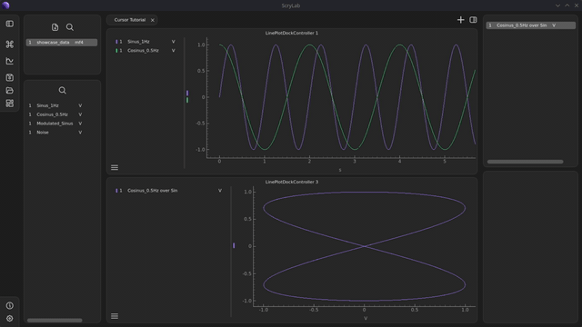
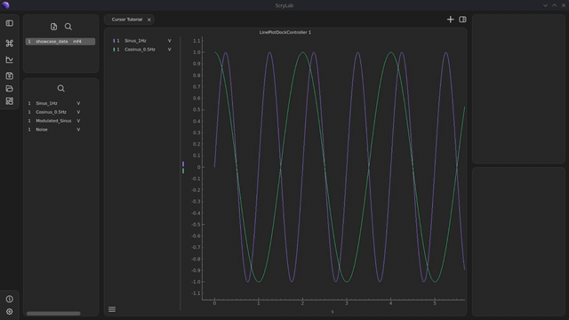
Create a plot with signals: Plot one or more signals as shown in the Quick Start tutorial.
Add a cursor: Press the
Ckey to add a cursor to your plot.You can move the cursor by clicking or dragging. Click on the desired position or drag the cursor along the x-axis.
Create a second plot: Create a second plot and add a signal to it.
Activate the cursor: Press the
Ckey to activate a cursor in this plot as well. The cursor will be synchronized by default to the same x-value where the cursor of the first plot is located.
Special Case: XY-Signals
Convert signals: Select two signals in the same plot. Right-click on one of the signals and select
Convert Signalfrom thePreprocessingcategory.Plot in a new plot: Drag the XY-signal from the Workspace widget into a new plot and activate the cursor here as well.
With XY-signals, no vertical cursor is displayed. Instead, only a scatter point is shown, which is synchronized with the original x-axis values of the source signals.
Move data points: You can move the scatter point to other data values by using the synchronized cursors in the other plots. The point will automatically follow the cursor positions.
Info
All cursors in a tab are synchronized by default. The synchronization can be disabled via the plot menu.
Using Ranges
Ranges allow you to define a region in your plots and hide all data outside of that region.
Activate a range: Press the
Rkey to activate a range. Two cursors and two data points with associated scatter points will now be displayed.Info
A range consists of two cursors that define the start and end point of the region you want to analyze.
Adjust the range: Move the two cursors to define the region you want to analyze.
Synchronize ranges across multiple plots: Like individual cursors, ranges are synchronized across all plots in a tab. Activate the range in other plots as well to consistently compare regions.
Range with XY-signals: Activate the range in the plot with the XY-signal as well. Two scatter points will now be displayed, showing the boundaries of the region. All data points outside this range will be automatically hidden.